Musings from the Moonroom

Thoughts on Art, Inspiration, Creativity and Spirit


2 Comments

Lady Blue

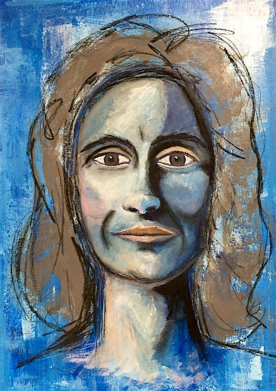
I’ve been setting aside most of the lessons from “Let’s Face It” as I focused on Gillian’s daily classes in “Drawn to Expression”

However, in week 9 of “Let’s Face It,” Juna Biagioni’s mini-lesson piqued my interest. In this lesson, Juna used a more expressive approach for creating her portrait. It seemed like a perfect follow-up to everything I’ve been learning in “Drawn to Expression.”

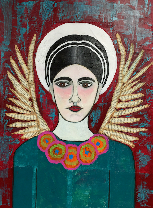
The result was “Lady Blue.” Materials used include watercolor paper prepared with a thin coat of gesso, Conte pencils, acrylic paint, and Caran d’Arche crayons.

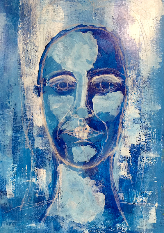
Background: Created with two shades of blue acrylic paint, plus white acrylic paint. Applied with a paintbrush and old credit card.

1LadyBlueBackground

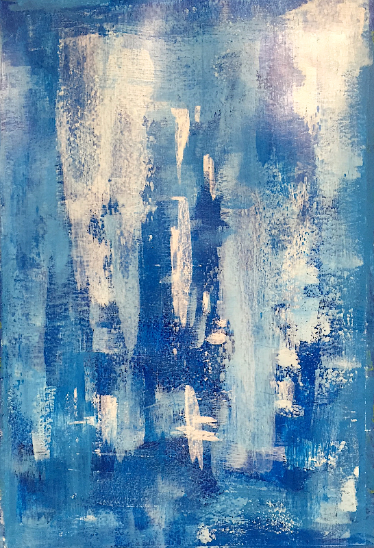
First Layer: The face was very lightly sketched onto the background. The first layer for the face was created with the same shades of blue acrylic paint as the background and applied loosely to the canvas. 2LadyBlueFirstFacePaintLayer

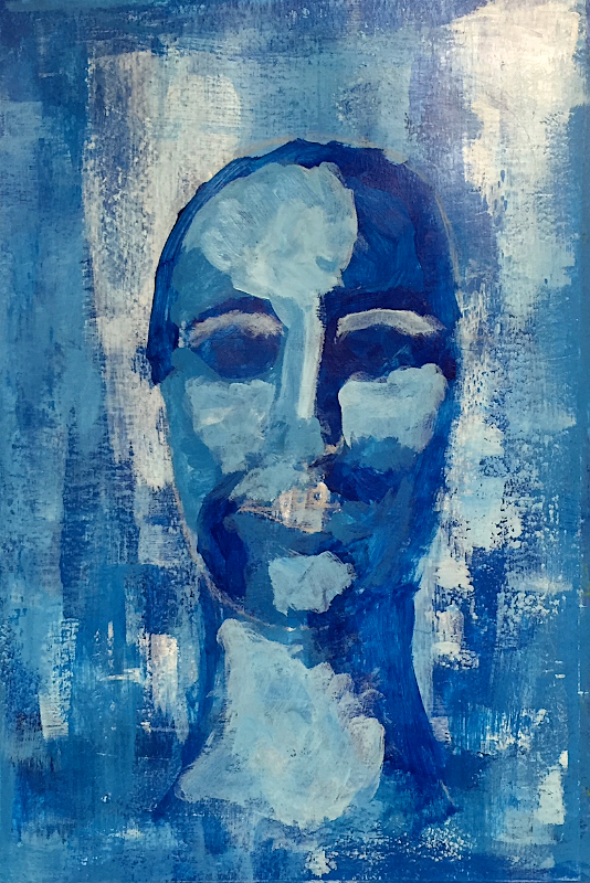
Sketching More Layers: The face was again sketched onto the first layer of paint. First with white Conte pastel pencil and then with a darker pencil. The intent is that each layer adds to the depth of the final portrait.

3LadyBlueFirstFaceSketchLayer

4LadyBlueDarkerFaceSketchLayer

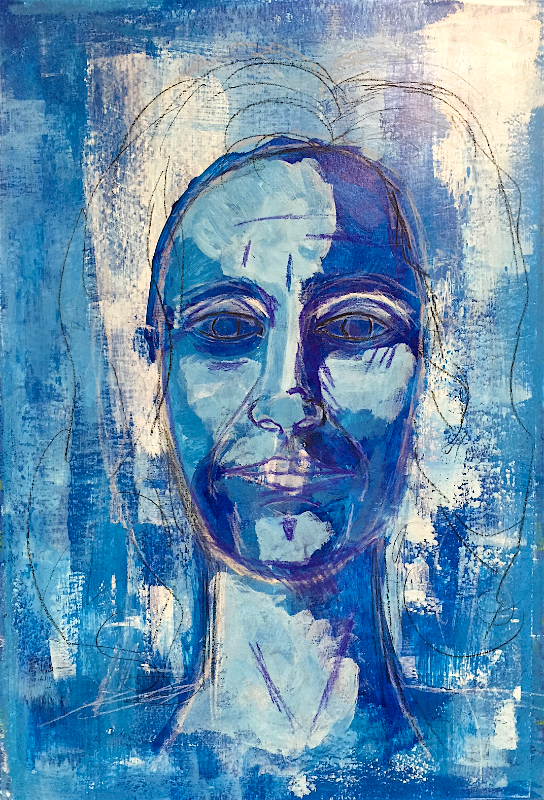
Lighter Tone Layers: Sketching is followed by adding paint in lighter tones. And more sketching.

5LadyBlueFirstFleshToneandHairLayer

6LadyBlueDarkSketchOverLightPaint

At this point, we’ve officially entered the ugly stage.

Back to the blue paints and Conte. Now it feels like this portrait is starting to come together.

7LadyBlueConteOverMoreBlue

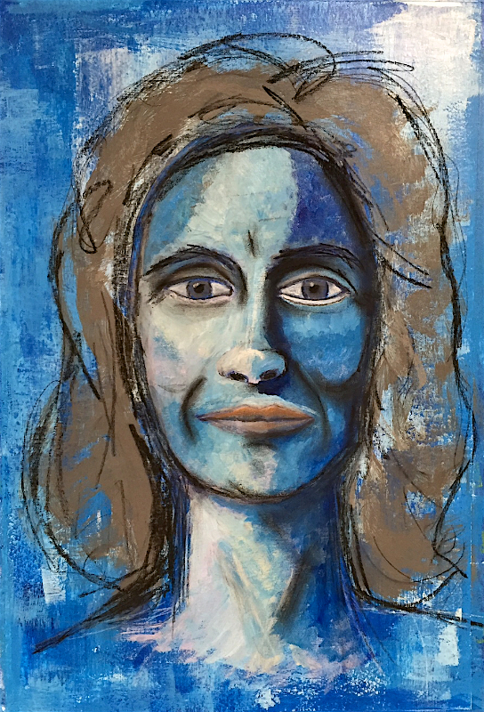
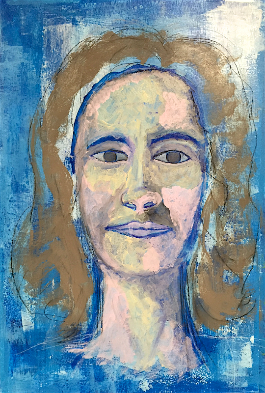
In Juna’s lesson, she eventually used oil paint sticks and oil pastels to smooth out the skin tone. I tried the oil pastels that I have but wasn’t thrilled with the result. I opted to use Caran d’Arche crayons.

8LadyBlueFinal

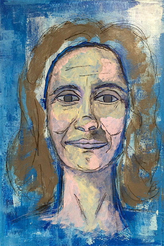
I really like the expressive tone in this finished piece. I debated with myself whether or not to fill in her hair. I tried to visualize how the piece would look if the hair was a solid color. My preference was for her face to be the focal point. Leaving her hair partially complete adds to the expressive nature of the piece, in my opinion.

I could’ve cleaned up the dark lines along the left side of her face and neck as they may look a bit too much like an outline. This self-editing thing can be a bit of a back and forth battle.

Finally, I really tried to emphasize the light and dark sides of her face. I think I achieved that. This is the first piece I’ve ever created using non-flesh tone colors to indicate highlights and shadows. In the past, doing that scared me. It seemed unnatural. Perhaps it depends on the particular piece. After this exercise, I feel more comfortable using that technique.


6 Comments

Going Back to the Beginning

One of the early exercises in “Let’s Face It” is to look back at some of the face sketches, drawings or paintings that we created early on in our creative journey. It’s a great exercise to remind us of where we started and where we’re going. It will also help us see our progress throughout the course this year.

So I thought it might be amusing to share with you some of my early face drawings and paintings. It’s okay to laugh or cringe at some of these faces. I do the same thing when I look at them.

Turn on the Way Back Machine, Mr. Peabody

These drawings were created about 6 years ago. I was dealing with some health issues and used art to work through that process. This was my self-portrait. The question mark represented not knowing what would come next in this situation.

HowIFeel120110_edited

I hated drawing noses and almost always placed the eyes too high on the head.

Ironically, I made sculptural pieces, my Spirit Messengers and Ornimals, for several years. But many of those pieces had heads/faces that were imaginative and not all were based on humans.

Fast Forward

Now it is 2013. I’m taking a non-art related class though we are creating mandalas or other forms of expression in response to readings. Here I decided to create my first “portraits” in many years.


I notice how much I enjoyed creating these pieces. Not anywhere near “perfect” but it reminds me how much I like drawing and painting.

As time progresses, I stop making sculptural pieces and turn my focus to sketching, drawing and painting. I start finding sources with instruction and guidance on drawing faces. (Waaaay too many resources, in fact.)

However, that doesn’t mean lady confidence emerges and my paintings of faces magically appear on the canvas. Hardly.

In these two paintings from 2014, I found myself quite afraid to paint eyes and noses. Again. Instead of taking the risk that I might completely mess up the faces, I found it easier to give the appearance of eyes (or eyelids). That perfectionist voice inside, the one who says “You should know how to do this” appeared to win this round.

Breakthrough

Finally, in 2015, my love of drawing faces and the desire to put in the effort to improve my skill comes full circle. I buy Pam Carricker’s book, “Mixed Media Portraits. I sign up for online classes. I’m invited to participate in a sketching group.

Now the practice begins to pay off.

Where is this leading?

Even though I took art classes during all four years in high school and had a basic knowledge of how to draw a face, I found that it was easier to avoid drawing or painting a face at all costs. Perhaps it was some old memory of being told I “couldn’t” draw that kept me from creating faces. Or old lady perfection who was more worried about screwing up the facial features instead of just playing and experimenting.

What I can say is that if you also love to draw faces, then by all means, draw those faces. There are many resources out there with tips and tricks to get you started. Yes, practice is important, whether it’s every day or a few times a week.

It’s also important, I think, that you try really hard to get past the worry that the face you’re drawing won’t look like whomever. I told myself early on that I wasn’t going for perfect portraiture. I’m developing my own style and you should too. Make your face drawings whimsical. Make them caricatures. Give them green hair and purple eyes. Have fun with it.

In both the “Let’s Face It” class and “Drawn to Expression” I’m feeling better about interpreting the faces in a way that fits my style. Whatever that style is at this time. Finding a “style” or “expression” doesn’t happen overnight for most of us. It takes practice (which, for practice sake, might include copying). It takes having an open mind and a willingness to play and experiment. It’s an ongoing learning process.


4 Comments

Her Name is Cherish

Next up in the Angel painting series, as part of the Angels Among Us online workshop, is “Cherish.”

This painting was created following some of the techniques provided by Deanna Strachan. Deanna was the instructor for week 6.

How did I get to week 6 when the last piece I shared was from week 2? I got bored. The beauty of falling behind in an online class is that you can choose which lessons you want to watch instead of waiting for the upcoming lesson. And since each lesson in Angels Among Us stands alone and is not built one upon the other, you can work chronologically or start wherever you like.

Anyways, I went to Pinterest for inspiration for the sketch of this angel. I found this painting by French artist Louis Treserras. I love this young woman’s face.

AngelFaceInspiration_Week6

And here is my sketch of this young woman’s face.

Week6_AngelFaceSketch

Once the background of my canvas was ready, I transferred this sketch on to the canvas. As with some of the other lessons, it seems to be popular to glue a layer of torn paper onto the canvas first and then paint on top of it. I’m still not sure if I like this technique. It can give you some interesting texture in your background. However, I’ve also had papers peel off and tear away from the canvas. So the jury is still out on this approach.

1CherishSketch_BackgroundCanvas

Face sketch transferred onto background

Oh yes. Now I remember another thing I don’t like about the torn paper backgrounds. When transferring an image, the texture from the torn papers can sometimes muck up the transfer. In this piece the lines of the sketch weren’t lining up. I had to remove as much of the original transfer as I could and then try again. Poor girl’s nose was looking a little twisted and her eyes uneven. Fortunately I knew I could correct some of this once I started painting her face.

2Cherish_FirstLayerFace

First layer face paint

One thing that was fun with this lesson was Deanna’s loose approach to painting. My confidence in painting faces is also improving. The combination of loose paint strokes, better paintbrushes, confidence and wet paint was a recipe for success.

3Cherish_MoreFaceDefinition

A bold lip color

When I got to this point, I thought I would give her a nice, soft lip color. You know. Angelic like lips. Hah! In Deanna’s lesson she used a magenta color with a small amount of black. I didn’t have the exact same color and ended up with a deep purple tone. I figured I could always change it to something lighter if I found it really repulsive.

I didn’t change it. The color makes a bold statement. Cherish owns those lips!

And then came the wings…

4Cherish_WingsOutlined

Now I’m not so sure about this. I think she’s looking more like a fairy than an angel. Not that there is anything wrong with fairies. But this wasn’t quite what I had in mind.

Unfortunately, my brain seemed to be hitting a wall when it came to figuring out a different way to work the wing. It took a few attempts before I finally felt satisfied with it.

5Cherish_WingsPainted

A few more tweaks here and there and then she was complete.

6_CherishAngel

Her Name Is Cherish

7CherishAngel_FaceClose

Cherish


2 Comments

Frida Inspired Angel

Life has a curious way of distracting us from our other plans. Such as it is with my attempts at blogging on a more consistent basis. However you might define consistent.

Anyways, I finally put my butt in the chair and uploaded the rest of the pictures for my Frida-inspired angel. This is the angel created in the first lesson of Kara Bullock’s “Angels Among Us” online workshop. You can see the first installment here.

Picking up where the previous post left off, here are more work-in-progress (WIP) images and the finished piece.

The initial layers of her face, hair and halo have been painted. Now it was time to sketch in her shoulders, torso, necklace, and wings.

Then came the color of her necklace, dress, and texture for her wings. And a few more tweaks to her face and neck. Of course.

I found a picture of Frida online and in it she is wearing this groovy necklace made of crocheted flowers. That became my inspiration for the necklace in this painting.

At some point, you have to stop focusing on the little details and move on to the background. It’s really easy to obsess over the little details. I lost count of how many layers of paint are on her face. Or how long it took to paint in her hair, adjust the width of each row, and make sure each section landed evenly on both sides of her head.

With the background painted, she really started to pop off of the canvas and the painting finally felt like it was coming together.

10Frida_Background

An Eye Popping Background

From this point I focused on finishing her necklace and making some final adjustments to her dress and face. She had finally come together and I was super happy with how she looked.

12FridaCropped_iPhoneversion

Frida-inspired Angel (cropped)

11FridaComplete_iPhoneversion

Frida-inspired Angel (iPhone version)

I even pulled out my Nikon to take a few pictures of this piece. I’m a little rusty on taking art photos with a digital camera in manual mode. And the location where I set up this painting and my equipment wasn’t ideal. However, the resulting images give a slightly different “feel” to the painting; a more “aged” icon kind of look.

13FridaAngel_1

Frida-inspired Angel (Nikon version 1)

14FridaAngel_2

Frida-inspired Angel (Nikon version 2)

Since this painting was finished, I’ve completed a second lesson creating an angel using watercolors and am in the process of working on another angel using acrylics. I’ll share those with you after the Thanksgiving holiday.


4 Comments

An Angel Appears

The month of September has come and gone. And with it we officially entered a new phase of life. Gone is the home we lived in for 12.5 years. Sold to a new family who seem to really love it and want to make it their own. It was a busy and stressful month with lots of back and forth between the old homestead and the new, moving out all those things we didn’t need, bringing home items that we wanted, and donating, selling, and tossing stuff in the trash.

Now it is time to breath and get back to the studio.

Today I want to share a newish painting that I created in over summer. In my last post, I mentioned a free tutorial offered by Kara Bullock . This angel painting was inspired by Kara’s tutorial. It is not the subject of her tutorial. I didn’t want to create the exact same thing and simply used it as a springboard for this piece.

An Angel Appears

Since I was thinking about taking Kara’s online class “Angels Among Us” I decided to try my hand at creating an angel painting. I combined some of Kara’s techniques with techniques learned in other classes. Here is the result.

I almost always consider the beginning (and sometimes the middle) of a painting to be the ugly phase. An angel is no exception.

At this point I was relearning how to draw and paint faces. The errors in my face sketch became more evident when I started painting on the details. Eyes too close. Flat features. Asymmetrical. Oh well. It was a good time to move my attention to her gown and wings.

I didn’t realize the challenge of creating angel wings with feathers. When I first added the feather detail, her wings looked like they were hijacked by Spiderman. A fair amount of white paint and paint marker did the trick. More work on her face and her hair. Then, all of a sudden, a pretty angel emerged from the canvas.

Nearly finished...

Nearly finished…

A few final details on her sash and repeating the color around the neckline of her gown really pulled this piece together.

An Angel Appears

An Angel Appears

I did sign up to take Kara’s workshop, “Angels Among Us” and recently started working on the first lesson. I’ll share the results of those pieces in the coming weeks.


2 Comments

“Free Painting”-The Spirit Dance Series

I don’t know what happens when I free paint. I don’t know what moves me-the music playing in the background, the silly dance moves I make in the studio, the meditation, the Hara breathing or the Reiki. Sometimes it just flows and there it is.

I step back and I’m looking, looking, looking at the canvas. “What do I see?” “What should go there?” And then an image might appear. Or a color. Or shape comes to mind and I paint it. I don’t always trust it but I go with it. I’ve learned over the years that if I try to control where a piece wants to go, it comes out crappy. If I just follow its lead, then we might get something interesting. I try not to let the negative voice invade my space. If and when it does, I move on to something else. Come back later. It has no place here.

The Series

These paintings are inspired by a trip to the Peche Merle caves, near Cabrerets, France. I had the opportunity to visit these glorious caves in June as part of an art workshop. Inside the caves are paintings; horses, bison, mammoth. Some of the paintings are more than 25,000 years old. When we returned from this field trip, we began to paint. Mark making really. And out of the marks emerge images. And as is typical of my paintings lately, spirit figures emerge. Hence the name “Spirit Dance.” Below are the first two pieces.

Spirit Dance 1

Spirit Dance 1

Spirit Dance 2

Spirit Dance 2


Leave a comment

Ancestors

One of the paintings that I started in my class with Flora Bowley is finally complete. This piece is called “Ancestors.” The title was came to me while I was doing some research into my family history. Here are several pictures that document this painting’s evolution.

Wet on Wet

Wet on Wet

FirstCanvas_FirstCoolLayer

FirstCanvas_MoreCoolLayers

FirstCanvas_FinalWarmLayer

FirstCanvas_BlackandWhiteValue

FirstCanvas_TranslucentLayer

FirstCanvas_AddingImages

Adding an Angel

Adding an Angel

Face appears

Face appears

Buh-buh angel

Buh-buh angel

Ancestors in process

Ancestors in process

Ancestors_Orb_Cross

Ancestors_BirdTail_Orb_Cross

Ancestors_Bird_Orb_Cross

Ancestors_CrossandFace

Ancestors_Bird_Stars

Ancestors_Stars_Bird_Orb_Cross

"Ancestors"  18"x24" acrylic Amy A. Crawley, 2014

“Ancestors”
18″x24″ acrylic
Amy A. Crawley, 2014


4 Comments

Grabbing the Brass Ring

During the winter, my local art guild had a creativity challenge for members. We’ve had these “exercises” before and it’s always fun to see what people create when challenged to think out of the box, out of their comfort zone, and/or out of their usual medium.

In this particular challenge we were asked to create something inspired by, or with, a found object. But not just any ol’ found object.  Nope. This time members brought a found object from their home, placed in a paper bag, to our monthly meeting. All the bags were put in the middle of the table. Then we took turns, kind of, choosing a bag from the pile. No peeking. Off each of us went with our little found object of inspiration. The deadline for revealing our found object creation would be the next month’s meeting.

What was my found object? Two brass rings about 1″ in diameter. They look like rings you might find on an apron or a belt. My first reaction? What the heck am I going to do with these?

My Creative Process

I looked at those rings and my brain came back instantly with a big blank. Kind of like a sheet of white paper or an empty canvas. Absolutely NOTHING. I put the brass rings on one of my work tables and let them sit there for a few days.

Finally, feeling a bit like Pooh Bear when he starts to think, I decided to use a word association game to stimulate some creative ideas.

poohbear_think-1

I looked at the brass rings, held them in my hand, and started writing in my sketch book. I wrote down anything that came to mind when I looked at the rings. Things like “One ring to rule the world” and “Circle of Life” and “Two rings for marriage.” Even completely unrelated phrases such as “Cool runnings” and “Square peg in a round hole” were fair game.

Then I let the list sit for a few more days. Because no ideas were coming to me. Yet. I believe you can’t force the process.

Breakthrough

This challenge came during the time I was taking Flora’s class. That meant I had several canvases strewn about the studio in different phases of creation.  A few of them were used to collect excess paint. If I had extra paint on my brushes or on my main palette at the end of a painting session, I would swipe the brushes clean on a blank canvas. This is when my breakthrough happened.

I remembered Flora telling us that one way to create an intuitive painting is to work with shapes. Repeating shapes. Abstract shapes. It didn’t have to be complicated. KISS, I say. Keep it simple, stoopid.

I picked up one of the excess paint canvases and a Sharpie marker. I started to write all the phrases from my sketch book, the ones from my word association game, onto the canvas. I started writing on the long side of the canvas, turned it 90 degrees, and continued writing on the short side. Turned it 90 degrees again and kept writing on the long side. As I wrote, even more words came to mind. I did this until all the phrases were written on the canvas in a continuous square-circle shape. It ended when I was almost near the center of the canvas.

Somewhere along the way I had an idea to paint the brass rings white and where I would put them on the canvas. I would use the circle shape as my inspiration.

Result

I don’t have a lot of process pictures. You know how it is when you get into the flow and just keep working. Who has time to think about stopping and taking pictures along the way?

This is the canvas at a very early stage when it was used to collect excess paint.

BeforeBrassRingBy the time I started writing words all over it, several more layers had been applied to the canvas. The face disappeared quickly.

The picture below is one of the few in-process pictures I found. The brass rings that started this whole piece are in the lower right corner. I attached them to the canvas with heavy gel medium.

Brass Rings In Process

Brass Rings In Process

The remaining pictures show the finished canvas.

Brass Ring Detail

Brass Rings Detail

Brass Rings Circle Detail

Brass Rings Circle Detail

Brass Rings Full Length Detail

Brass Rings Full Length Detail

"Brass Rings"  Amy A. Crawley, 2014

“Brass Rings”
11″x14″
Acrylic, Sharpie marker, found objects
Amy A. Crawley, 2014

Most of the words I wrote on the canvas were covered by paint. Though if you look at it real close, you may see a few words or letters peeking through the paint.

This piece taught me how to work with a limited color palette, repetition of shapes, and creating movement in the piece so your eye travels around the canvas.

Thanks for stopping by.


4 Comments

My First Two Weeks With Flora

As promised, I wanted to share with you my progress in Flora Bowley’s Bloom True online class. This class focuses on painting intuitively. That is, listening to your inner voice for direction, practicing non-attachment, getting rid of expectations, and playing. Lots of playing.

Believe me, it is not as easy as it sounds.

Listening to my inner voice isn’t hard. I’ve been doing that for a while now. Practicing non-attachment, not wondering what the final painting will look like, not letting the inner critic get too loud. Those things are much trickier to put into practice. Even playing with paint on the canvas can be a challenge at times.

Our first couple of weeks have been spent getting to know our canvas, putting lots of layers on it, playing with the paint and textures and shapes. Here is my progress so far.

If you have a cat or dog at home, you know they want to help out in the studio.

"I wonder if Mom will let me help her paint?"

“I wonder if Mom will let me help her paint?”

We experiment with how to apply the first layer of paint. Wet on wet and then blindfolded. (Um, just me. Pippin did not participate. Really. Have you tried to blindfold a cat?)

Three Canvases Ready to Go

Three Canvases Ready to Go

After this approach, we work on adding layers. Warm layers, cool layers. Lots of layers. There is no right or wrong way to add layers of paint. Nor is there any magic number for how many layers to put on the canvas. It’s all about play and listening to your intuition.

First Canvas Progress

Here is the paint progression and transformation of the first canvas. (Click on the first image to start the slideshow.)

Second Canvas Progress

I work on at least two canvases at a time. While one canvas is drying, I can paint on another canvas and stay in the flow. (Click on the first image to start the slideshow.)

At this point, the paintings have gone through the “Wow, that’s cool” stage and the “Ew, that is really ugly” stage. Several times. Toward the end of last week I was getting better about practicing non-attachment and allowing myself to say “Wait until tomorrow” before passing too much judgement onto the piece.

Many times, seeing the painting with fresh eyes in the morning has been all it takes to appreciate the process.

I still have no idea where either painting is taking me or what they will look like in the end. And that’s okay.

I’ll leave you with another cute cat picture. Pippin decided if he couldn’t help paint my canvas, he’d get creative with the drop cloth.

PippinGetsCreativeWithFloorTarp


2 Comments

Youth, Maiden, Mother, Crone

I don’t remember when I first heard the word “crone” in reference to older women. I do remember, however, thinking it was a horrible word. Just what an older woman wants to be called-a “crone.” Seemed to rank right up there with the words “spinster,” “hag,” and “old lady.”

Ironically, I find myself now facing that “crone” phase of life. It is a time of life that I am doing my best to embrace.

So where do the names come from? They seem to originate from Pagan or Wicca traditions. The Maiden is the young girl or woman who is full of enthusiasm, youthful ideas, and new beginnings. The Mother represents fertility, abundance, and growth. Finally, there is The Crone, the wise woman. Each phase represents a specific period in a woman’s life.

Prior to starting Flora Bowley’s Bloom True online class, I started painting on an 8″x11″ canvas. After I applied the initial layers of paint, my inner voice said to me “Crone. The name of this piece is Crone.”

Um, okay. I was simply calling it “Three Yellow Orbs.”

“And add a circle of cream colored paint right there” my inner voice said as I looked at the wet canvas.

Here is the canvas with the initial layers (when this conversation happened.) Do you see what my inner voice was telling me?

3YellowOrbs_8x10_Pt1

I’ve learned over time that listening to my inner voice, my intuition, is usually a good thing. The trick is not to react emotionally to that voice. I try my best to say “okay” or “hmm” first; to at least acknowledge it.

The next day I came back to the canvas and went to work. I let my intuition guide the process-choosing colors, writing words, adding paint and removing paint. The word “crone” stayed fixed in my mind, as did the words “youth,” “maiden,” and “mother.”

Finally, the painting was finished. I didn’t want to add any more lines or words or images. Here is what was appeared on the canvas.

Youth, Maiden, Mother, Crone (top third of painting)

Youth, Maiden, Mother, Crone (top third of painting)

Middle third of painting

Middle third of painting

Bottom third of painting

Bottom third of painting

Youth Maiden Mother Crone (Amy A. Crawley, 2014)

Youth Maiden Mother Crone
(Amy A. Crawley, 2014)

I really have no idea what some of the various marking and shapes mean. I’m not sure if it has to mean anything. It simply is.

If you’d like to read more about these phases of a woman’s life, check out The Three Stages of a Woman’s Life by Linda E. Savage.

______________________________________________________________________________________

I’m now into the second week of Flora’s online class. I’m learning a lot and having several a-ha moments. I’ll share my progress in my next blog post.