I truly hoped to have posted another update before now. Sometimes it is hard to pull myself away from other tasks in order to post a new blog entry. Curious how priorities change over time. When I had my business, I was very good about posting new blog entries. It was all part of that marketing, get-your-name-out-there thing.
Now, not so much. The business has moved on and I’m more involved with volunteer gigs, promoting art from the other side of the aisle, so to speak. (Not so much making my own art as bringing art to the community.)
And just as I was getting ready to post a new entry, our 13 year old cat got sick. He started to crash, really. Not eating. Lethargic. I feared the worst for him. And that brought up a lot of other stuff.
Fortunately, and thankfully, after a visit to his regular vet, the emergency vet hospital, and a few days and nights of treatment and observation, Pippin returned home and is on the road to recovery.
So let us now return to our previously scheduled program, er blog post…
Inky Expressions
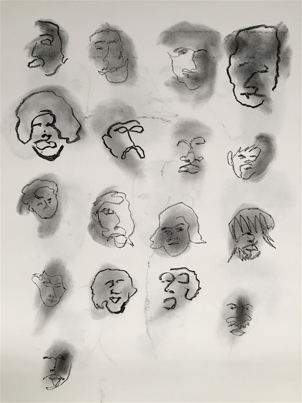
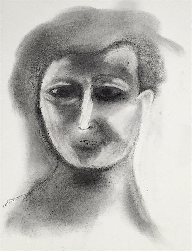
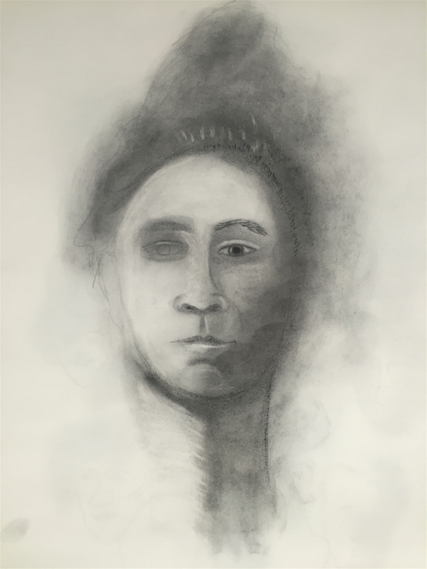
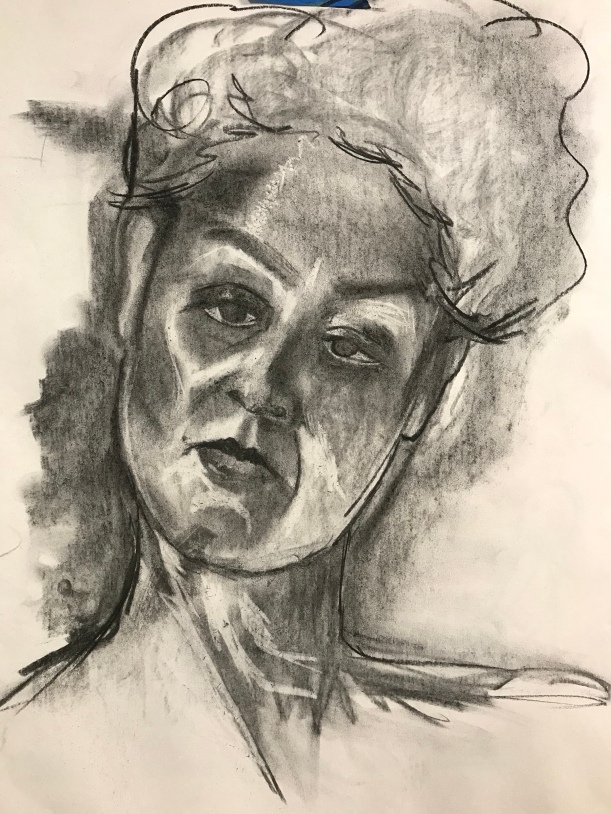
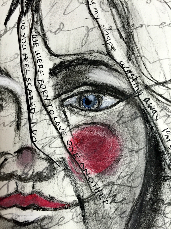
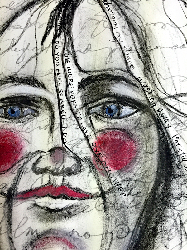
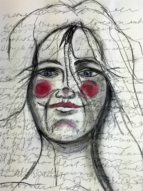
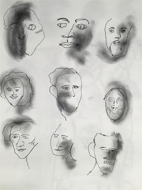
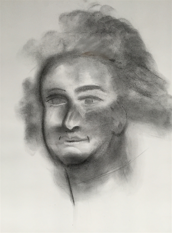
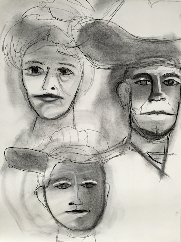
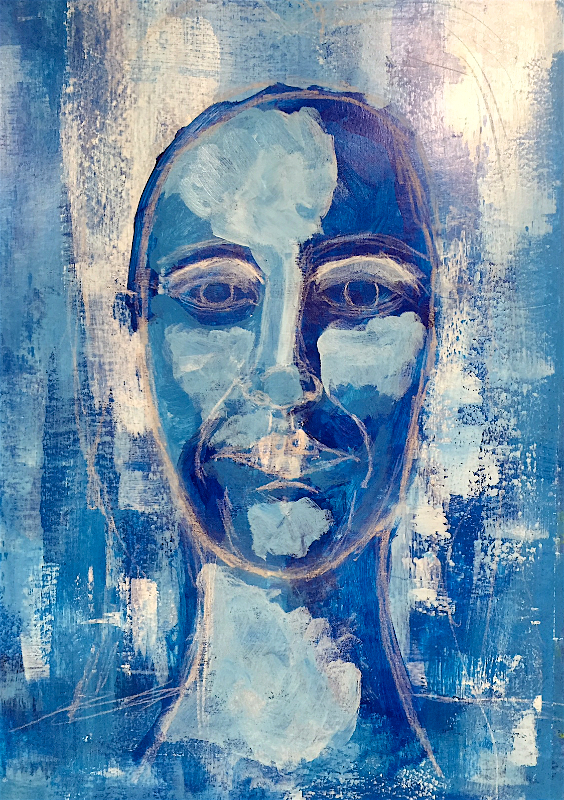
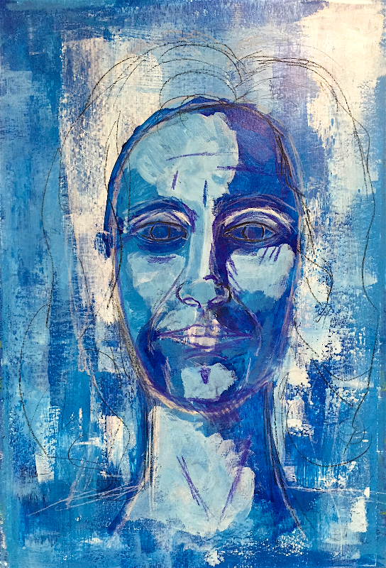
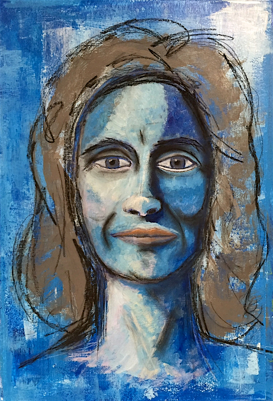
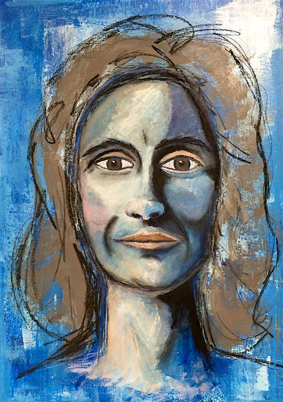
In the Drawn to Expression online class, we’ve worked with charcoal in its many forms. We’ve sketched faces and tried to loosen up our mark making.
Then Gillian challenged us, again, with ink.
I haven’t used India ink since high school. After we moved, I gave my calligraphy tools to a friend (nibs and two holders that I had since high school.) It was like Murphy’s Law. I hadn’t used them for many, many years, so why keep them now that we had downsized? And, of course, just because I gave them away…
This is why people hold onto things. You never know when you might need those things again.
But I digress.
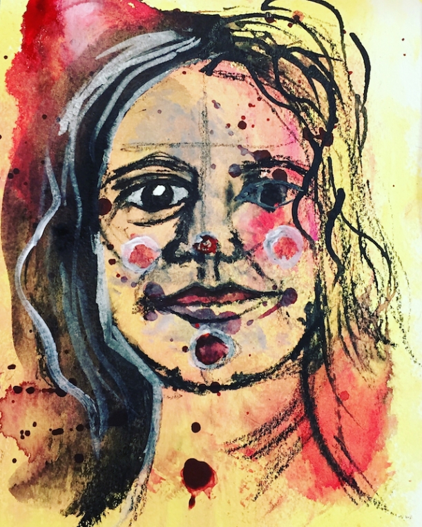
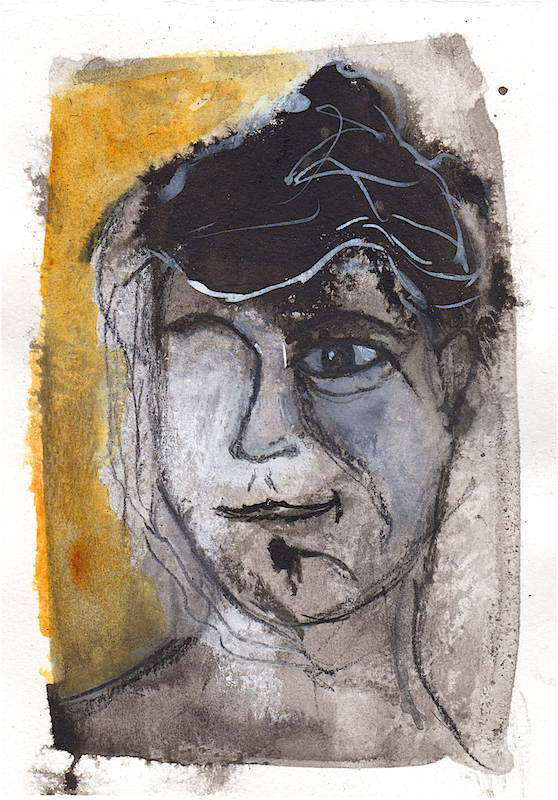
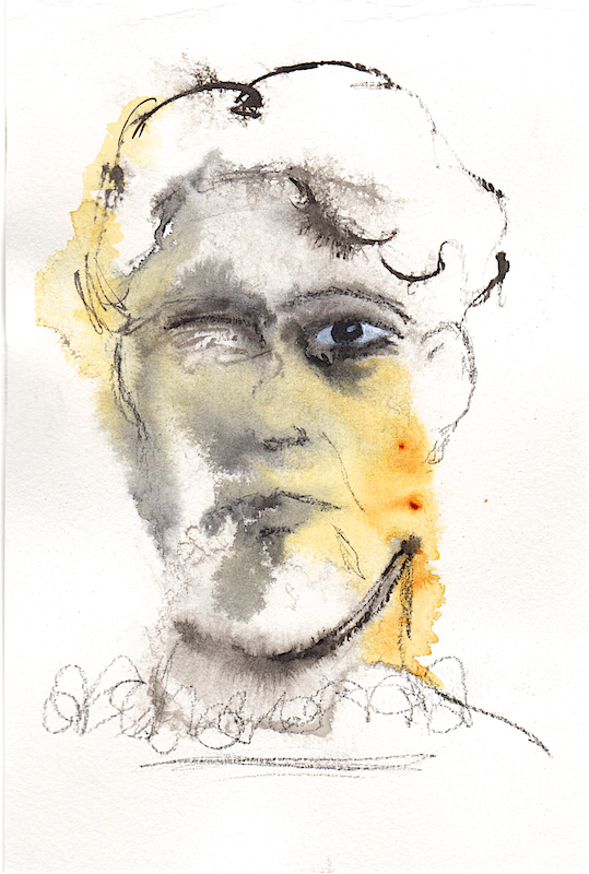
We started by making small, inky faces. Similar to the timed task when we sketched small faces. But ink is less controllable.
Quite frankly, I did not like working with ink. Well, not the ink itself, but the bamboo dip pen. It took quite a bit of trial and error to figure out how to hold the dip pen in order to get the best flow of ink. It really didn’t work well for me when the paper was on the easel. Working on a flat surface is a bit better.
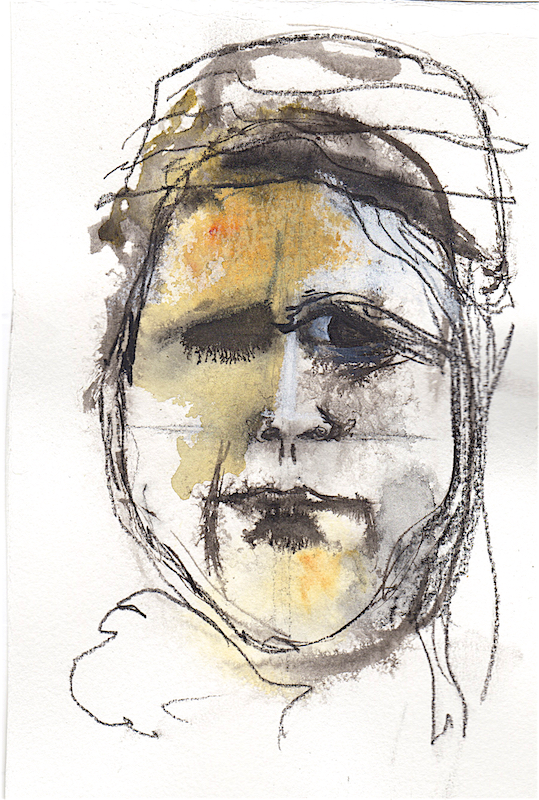
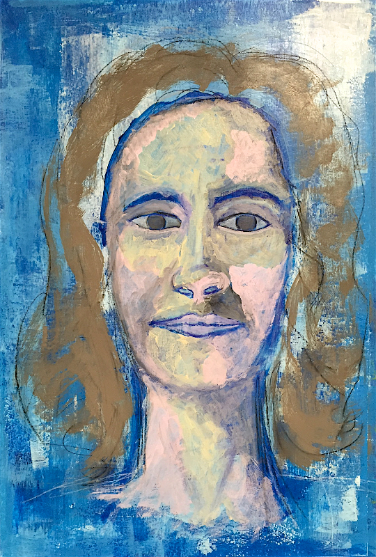
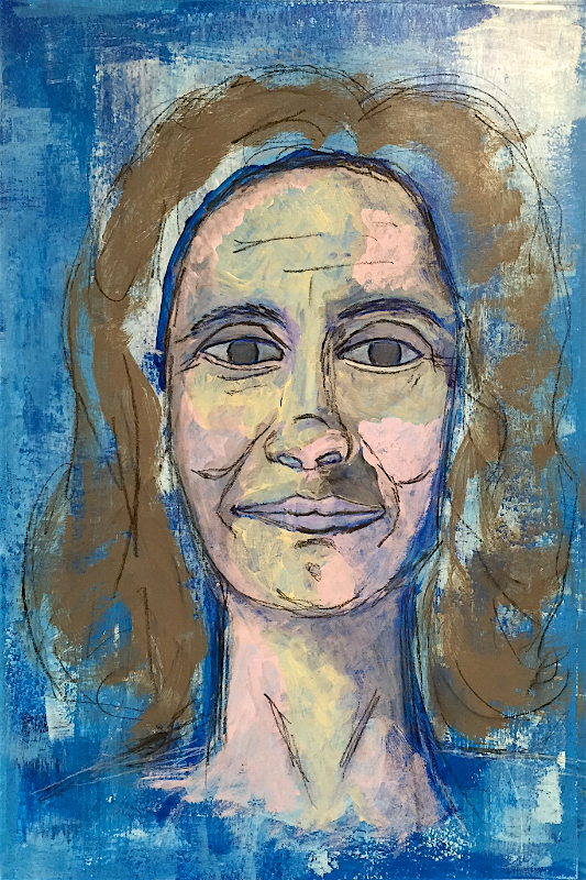
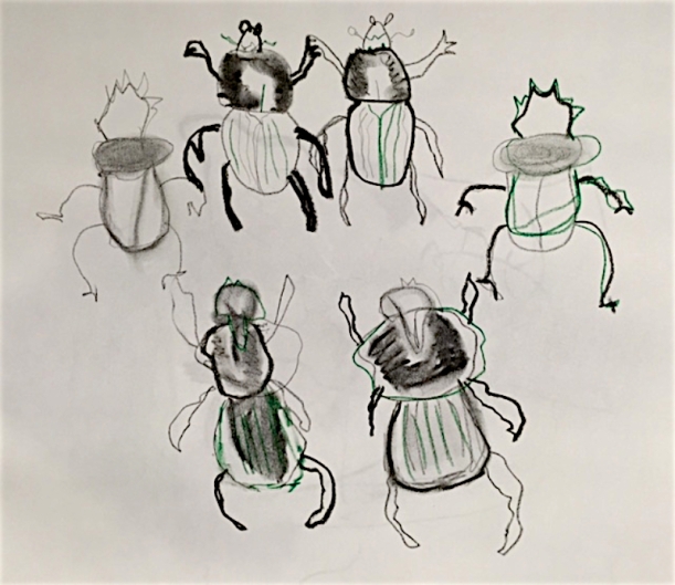
One Object-Three Ways
Next up, sketching an object from three different perspectives. Tools used included a dip pen, nib, paintbrush, squirt bottle, Marks-all pencil, black and white ink.
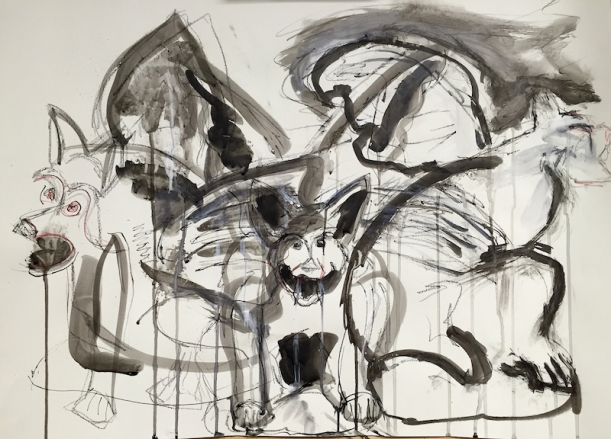
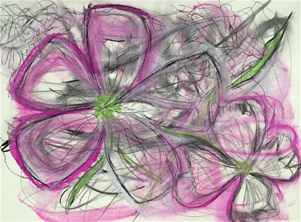
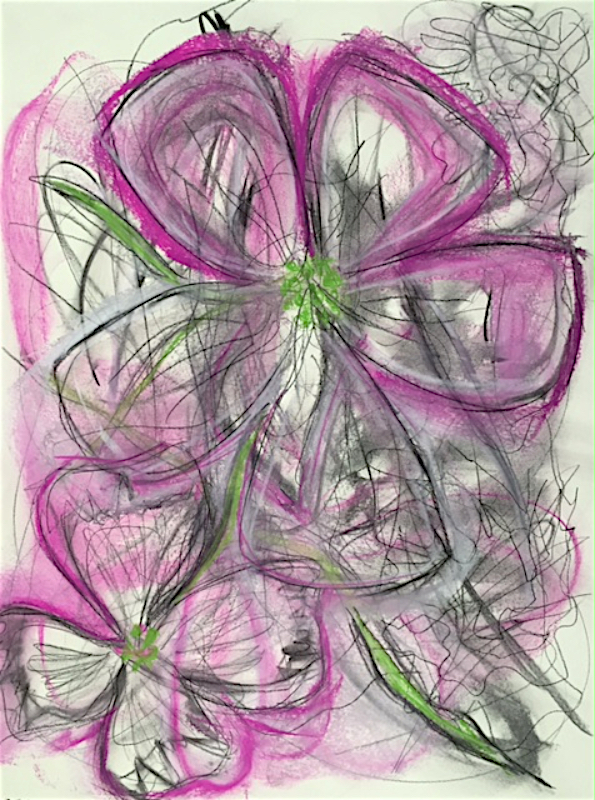
Overlapping Inky Gargoyle
This was a bit more fun. Love the drippy ink. My favorites are the Gargoyle on the left and the one facing us straight on.
What I’m learning, though, is the cheap watercolor paper isn’t the best for ink work. Since this is just play and practice, it’s not terribly important. I also found that the ink was drying very quickly which may have more to do with the heat in my studio. In some sections of this piece I had to saturate the paper with water. Which subsequently made it buckle.
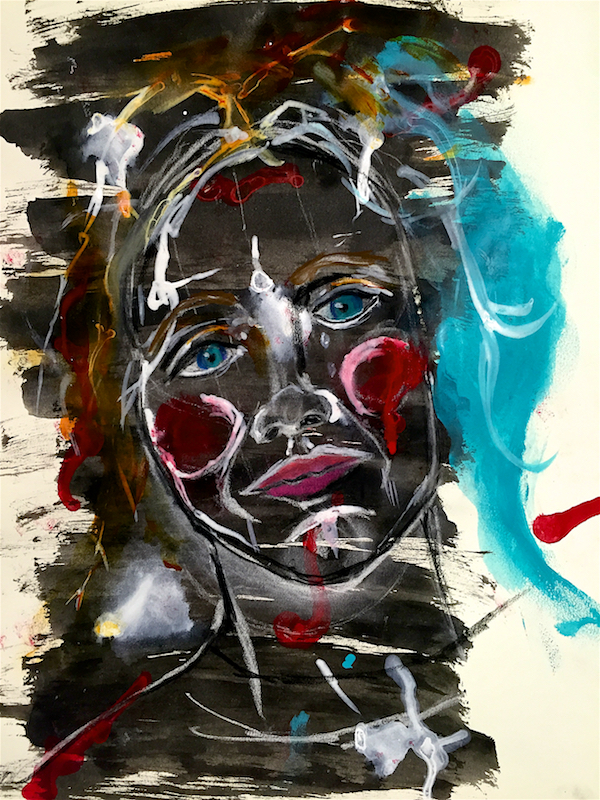
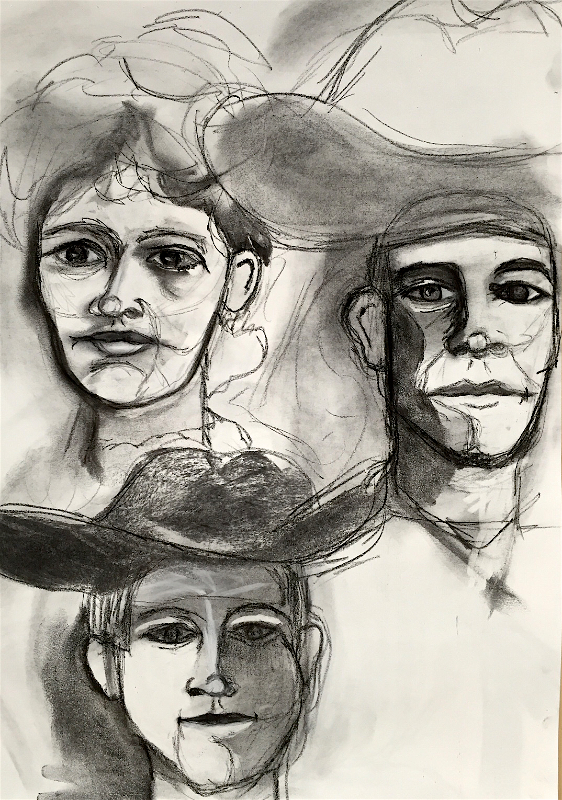
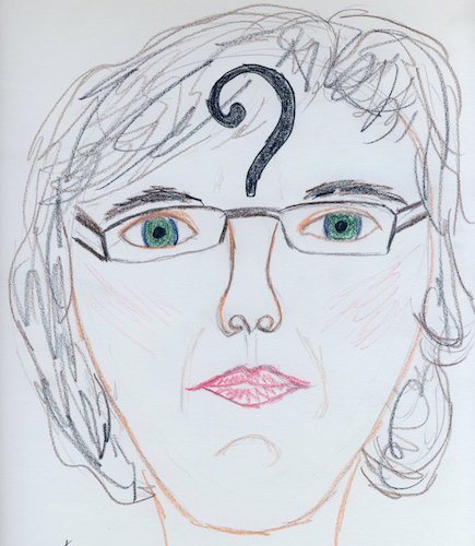
Overlapping Faces
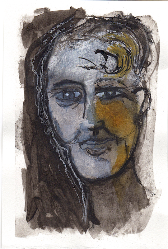
A final assignment in playing with inks was to sketch three different faces in three different perspectives. This was a challenge for me as my comfort zone is a straight-on face, facing forward. They are easier to draw and the ones that draw my eye whenever I look for reference photos.
But, we’re not learning if we stay in our comfort zone. So I found some new reference photos and gave it a go. Here we used inks, Marks all pencil, a bit of charcoal, white pastel, nibs, dip pen, and paintbrush and squirt bottle.
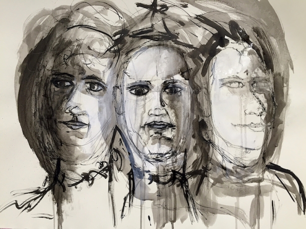
Three Inky Faces In Progress
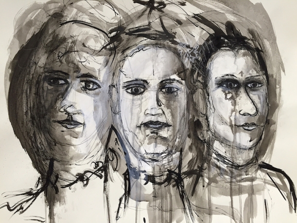
Inka-Dinka-Do Faces
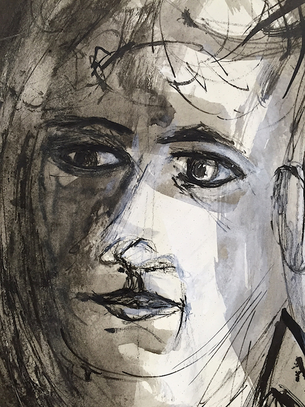
Left looking face
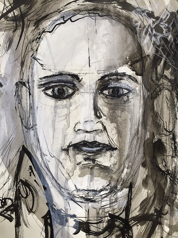
Straight on face
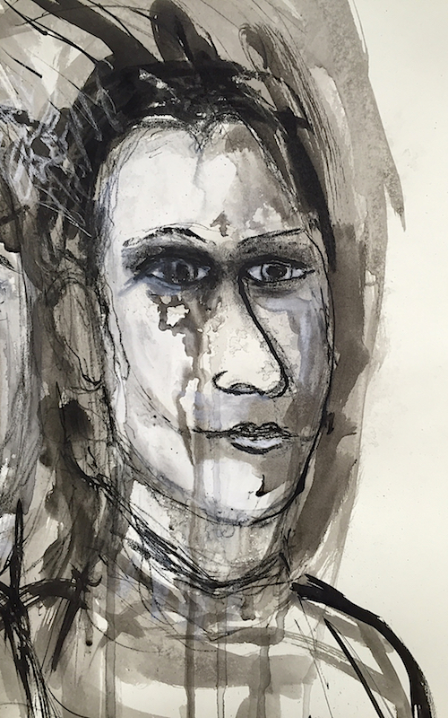
Right looking face
In the end, this turned out to be quite a fun exercise.
I believe part of what was holding me back was trying to achieve a look similar to Gillian’s when she creates her sample pieces. I know that in order to learn it is quite common to copy the samples that a teacher shares. I have no problem with that.
However, she and I have different styles. She has also been doing this a wee bit longer than I and has a bit more practice. Simply put, I find I do better if I let go of trying to copy and just try to make the piece my own with my own style (or lack there of.)
I’m also still learning how to create loose, expressive face portraits. I’ve got a feel for it using pencil and charcoal. Adding another new medium into the mix, the ink, and it felt like I was going backwards.
Overall, I’m happy with the way these overlapping faces turned out. Could I have pushed it a bit further? Perhaps. Or did I over do it, get too detailed and lose some of the expressive quality? Maybe. Self-editing is a never ending learning process. It continues to take practice, practice, practice.


")